Brand evolution at REACT
Posted by Toby Wicks 28th March 2023 News
Estimated Reading Time: 0 mins
It’s hard to nail expenditure on at least two emotive big tickets as the Chief Executive of a small-ish charity: the headquarters building and branding.
REACT’s headquarters is clearly at one end of the spectrum, if I’m to believe a journalist who interviewed me a couple of months ago at Chilmark. On greeting him, he immediately stroked the wall in front of us and said, “Toby, you can tell every pound that this organisation raises is going exactly where it’s needed and not into your accommodation!” For those who haven’t yet had the pleasure, our “no-frills” headquarters is located within a former Royal Air Force armament depot opened in 1937.
Our brand was really established in 2020 as the immense response of REACT’s volunteers and staff to the COVID pandemic catapulted the organisation forward. This was so evident during my induction, 18 months ago, when speaking with senior government officials leading resilience efforts in the UK - “an exciting platform on which to build” - was the headline takeaway from most of those conversations. Yet, with the launch of our 2022-25 strategy and the desire to fully integrate our trading subsidiary into the organisation, at the beginning of this year it made sense to do a quick pulse check on the brand.
Re-naming our trading subsidiary (formerly known as RE:SILIENT) was a no-brainer as we’re just too small to manage two brands effectively, enabling the two offers to be joined at the hip under the same name. We also received consistent feedback that our logos looked too busy, and their use was inconsistent. The colon was problematic for web-related use, and the roundel ("short version") didn't relate to the primary logo. Often the brand's shade of blue was too dark, which made it difficult to read…
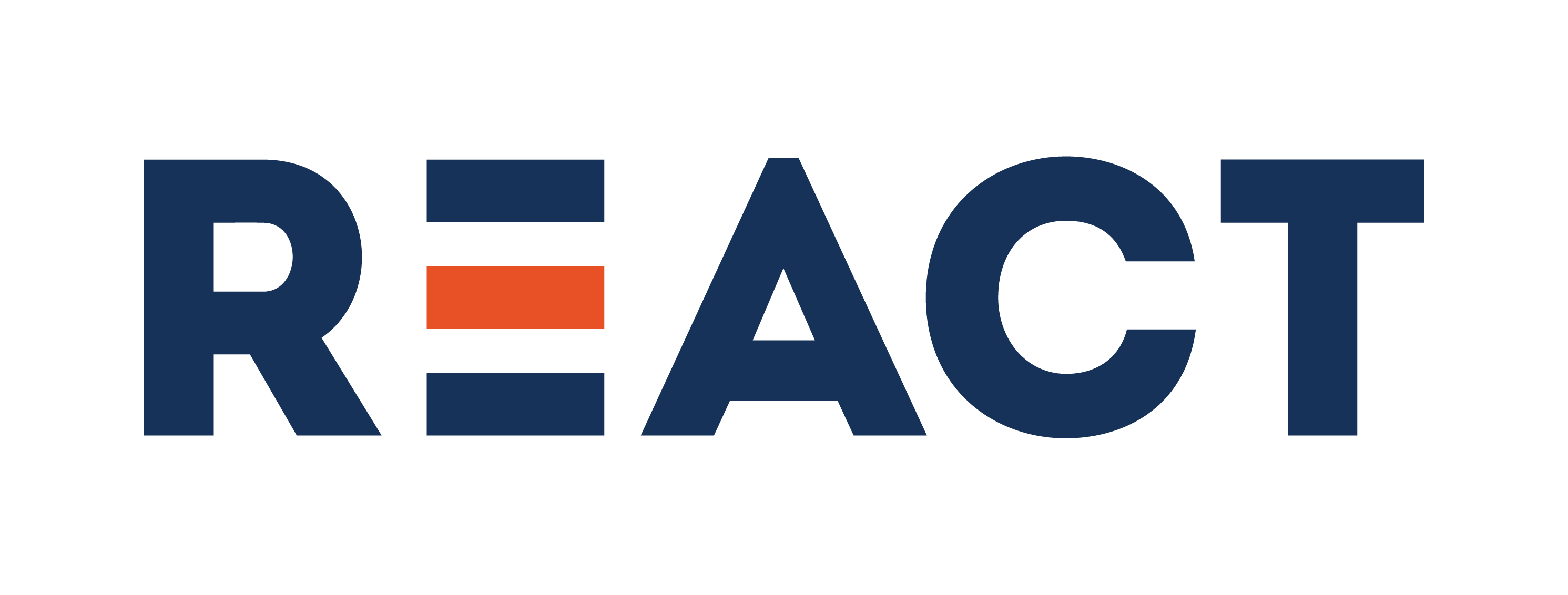
We worked with a designer friend on a few options and with the help of a small group of internal and external stakeholders, it was pretty straightforward to decide on the way forward. The result you can see below.

In the refreshed version, we kept the three stripes since they were an existing strong distinguishing visual. Apparently, they also give the impression of speed! We matched the fonts in the roundel and primary logo for consistency, adjusted the spacing and ditched the colon as it didn't provide strong creative reasoning to justify its use. We chose a lighter blue shade that still provides good contrast with the orange. Finally, for those looking for deeper meaning, some like to think that the middle stripe of the ‘E’, now orange, represents the affected population at the heart of everything we do.
In this instance, I hope “good enough” makes sense. It’s an evolution. Our brand refresh borrows equity from our history and incorporates flexibility to create a visual identity that is unashamedly agile and undeniably REACT as we transform and grow to maximise results for the hardest to reach and most vulnerable.
Toby Wicks
Chief Executive
You can find our updated brand guidelines here.
